My name is Vince Knight and I'm a lecturer in Operational Research at Cardiff University with interests in game theory and queueing theory. I'll be using this blog to post about various things mainly including math and software...
www.vincent-knight.com
For the past 4~5 years now I've been lucky enough to tag along with +Paul Harper when he does outreach in high schools. I've developed my own little 'roadshow' that introduces students to Game Theory.
On Wednesday there was a cool event at the School of Mathematics where we had 120 odd 17 year olds in to get a taste for the Mathematics at University (some pics: here and here).
I've blogged many times (and +Dana Ernst has as well: here) about the activity that I run which involves a Prisoners dilemma tournament and 2 rounds of a 2/3rds of the average game, here is my updated set of results over all the times I've played it (the second guess is after we all discuss rational behaviour):
(if any of my student are reading this the above could help them win a box of chocolates on Monday)
This is not the purpose of this post.
Something terrible happened on Wednesday.
During my activity I always show this clip from A Beautiful Mind (awesome movie about John Nash):
Before showing the clip I always ask: "How many of you have seen the movie 'A Beautiful Mind'?".
Now, I've been doing this for 4~5 years and the response I get to this question has made me realise that I'm not cool anymore. I guess there's a point in everyone's life where that realisation hits them. I've been in denial until Wednesday when for the first time ever: not one student had seen the movie :'(. This makes me sad because I think this is probably one of my favourite movies and one I've always thought was pretty cool.
Here's a little plot showing what I've been telling myself over the past few years (the fact that xkcd style graphs is now native to matplotlib is cool, my previous attempt at one of these: 'probability of saying yes to academic responsabilities'):
When I first asked and had about a quarter of the room know what I was talking about I thought that it was kind of cool and a sign of no longer being a kid...
When in twenty years time I embarrass my daughter by opening the door to her boyfriend/girlfriend wearing pyjamas; inviting him/her inside for a talk and reading him/her passages of my PhD thesis or whatever else I can think of, I'll be able to say that it's revenge for not being cool any more and that I made this decision on the 22nd of January 2014.
For a while now there's been a 'game' going on with our pigeon holes where people would put random objects in other people's pigeon holes (like the water bottle you see in the picture). These objects would then follow a random walk around the pigeon holes as each individual would find an object in their pigeon hole and absent-mindedly move it to someone else's pigeon hole.
As such each pigeon hole could be thought of as being a transient state in a Markov chain (http://en.wikipedia.org/wiki/Markov_chain). What is really awesome is that one of the PhD students here didn't seem to care when these random objects appeared in her pigeon hole. Her pigeon hole was in fact an absorbing state. This has now resulted in more or less all random objects (including a wedding photo that no one really knows the origin of) to be in her pigeon hole.
I thought I'd have a go at modelling this as an actual Markov chain. Here's a good video by a research student of mine (+Jason Young) describing the very basics of a Markov chain:
To model the movement of an object as a Markov chain we first of all need to describe the states.
In our case this is pretty easy and we simply number our pigeon holes and refer to them as states. In my example there I've decided to model a situation with 12 pigeon holes.
What we now need is a set of transition probabilities which model the random behaviour of people finding an object in their pigeon hole and absent-mindedly moving it to another pigeon hole.
This will be in the form of a matrix $P$. Where $P_{ij}$ denotes the probability of going from state $i$ to state $j$.
I could sit in our photocopier room (that's where our pigeon holes are) and take notes as to where the individual who owns pigeon hole $i$ places the various objects that appear in their pigeon hole...
That would take a lot of time and sadly I don't have any time. So instead I'm going to use +Sage Mathematical Software System. The following code gives a random matrix:
N = 12
P = random_matrix(QQ, N, N)
This is just a random matrix over $\mathbb{Q}$ so we need to do tiny bit of work to make it a stochastic matrix:
P = [[abs(k) for k in row] for row in P]  # This ensures all our numbers are positive
P = matrix([[k / sum(row) for k in row] for row in P]) # This ensures that our rows all sum to 1
The definition of a stochastic matrix is any matrix $P$ such that:
$P$ is square
$P_{ij}\geq 0$ (all probabilities are non negative)
$\sum_{j}P_{ij}=1\;\forall\;i$ (when leaving state $i$ the probabilities of going to all other states must sum to 1)
Recall that our matrix is pretty big (12 by 12) so we the easiest way to visualise it is through a heat map:
P.plot(cmap='hsv',colorbar=True)
Here's what a plot of our matrix looks like (I created a bunch of random matrix gifs here):
We can find the steady state probability of a given object being in any given state using a very neat result (which is not actually that hard to prove). This probability vector $\pi$ (where $\pi_i$ denotes the probability of being in state $i$) will be a solution of the matrix equation: $$\pi P = \pi$$
To solve this equation it can be shown that we simply need to find the eigenvector of $P$ corresponding to the unit eigenvalue:
eigen = P.eigenvectors_left() # This finds the eigenvalues and eigenvectors
To normalise our eigenvector we can do this:
pi = [k[1][0] for k in eigen if k[0] == 1][0]  # Find eigenvector corresponding to unit eigenvalue
pi = [k / sum(pi) for k in pi]  # normalise eigenvector
Here's a bar plot of out probability vector:
bar_chart(pi)
We can read the probabilities from this chart and see the probability of finding any given object in a particular pigeon hole. The bar_chart function in Sage still needs a bit of work and at the moment can only print a single list of data so it automatically has the axis indexed from 0 onwards (not from 1 to 12 as we would want). We can easily fix this using some matplotlib code (Sage is just wrapping matplotlib anyway):
import matplotlib.pyplot as plt

plt.figure()
plt.bar(range(1, N + 1), pi)
plt.savefig("betterbarplot.png")
Here's the plot:
We could of course pass a lot more options to the matplotlib plot to make it just as we want (and I'll in fact do this in a bit). The ability to use base python within Sage is really awesome.
One final thing we can do is run a little simulation of our objects going through the chain. To do this we're going to sample a sequence of states (pigeon holes $i$). For every $i$ we sample a random number $0\ r\leq 1$ and find $j$ such that $\sum_{j'=1}^{j}P_{ij'}. This is a random sampling technique called inverse random sampling.
import random
def nextstate(i, P):
""" A function that takes a transition matrix P, a current state i (assumingstarting at 0) and returns the next state j """
r = random.random()
cumulativerow = [P[i][0]]
for k in P[i][1:]: # Iterate through elements of the transition matrix
cumulativerow.append(cumulativerow[-1] + k) # Obtain the cumulative distributionfor j in range(len(cumulativerow)):
if cumulativerow[j] >= r: # Find the next state using inverse samplingreturn j
return j
states = [0]
numberofiterations = 1000for k in range(numberofiterations):
states.append(nextstate(states[-1],P))
We can now compare our simulation to our theoretical result:
import matplotlib.pyplot as plt
plt.figure()
plt.bar(range(1, N + 1), pi, label='Theory') # Plots the theoretical results
plt.hist([k + 1for k in states], color='red', bins=range(1, N + 2), alpha=0.5, normed=True, histtype='bar', label='Sim') # Plots the simulation result in a transparent red
plt.legend() # Tells matplotlib to place the legend
plt.xlim(1, N) # Changes the limit of the x axis
plt.xlabel('State') # Include a label for the x axis
plt.ylabel('Probability') # Include a label for the y axis
plt.title("After %s steps" % numberofiterations) # Write the title to the plot
plt.savefig("comparingsimulation.png")
We see the plot here:
A bit more flexing of muscles allows us to get the following animated gif in which we can see the simulation confirming the theoretical result:
This post assumes that all our states are transitive (although our random selection of $P$could give us a non transitive state) but the motivation of my post is the fact that one of our students' pigeon holes was in fact absorbing. I'll write another post soon looking at that (in particular seeing which pigeon hole is most likely to move the object to the absorbing state).
In this previous post I posted some python code that would recursively search though all directories in a directory and find all .tex files. Using texcount and wc the code the script would return a scatter plot of the number of words against the number of code words with a regression line fitted.
Here's the plot from all the .tex files on my machine:
That post got quite a few views and +Robert Jacobson was kind enough to not only fix and run the script on his machine but also sent over his data. I subsequently tweaked the code slightly so that it also returns a histogram. So here's some more graphs:
Robert's teaching tex files:
Robert's research files:
It looks like my .6 ratio between code words and words isn't quite the same for Robert...
BUT if we combine all our files together we get:
So I'm still sticking to the rule of thumb for words in a LaTeX file: multiply your number of code words by .65 to get in the right ball park. (But more data would be cool so please do run the script on your files :)).
So today I found out about latexcount which will give a nice detailed word count for LaTeX files. It's really easy to use and apparently comes with most LaTeX distributions (it was included with my TeXlive distribution under Mac OS and Linux).
To run it is as simple as:
$ texcount file.tex
It will output a nice detailed count of words (breaking down by sections etc...). I don't pretend to be an expert in anything but I'm genuinely really surprised that I had never seen this before. I was about to write a (most probably terrible) +Python script to count words in a given file and just before starting I thought "WAIT A MINUTE: someone must have done this"...
Anyway, I've gotten to the point of not being able to watch TV without a laptop at the tip of my fingers doing some type of work so whilst keeping an eye on South Africa playing ridiculously well in their win over Australia in the rugby championship I thought I'd see if I could have a bit of fun with texcount.
Here's a very simple Python script that will recursively search through all directories in a given directory and count the words in all the LaTeX files:
#!/usr/bin/env pythonimport fnmatch
import os
import subprocess
import argparse
import matplotlib.pyplot as plt
import pickle
def trim(t, p=0.01):
    """Trims the largest and smallest elements of t.

    Args:
    t: sequence of numbers
    p: fraction of values to trim off each end

    Returns:
    sequence of values
    """
    t.sort()
    n = int(p * len(t))
    t = t[n:-n]
    return t

parser = argparse.ArgumentParser(description="A simple script to find word counts of all tex files in all subdirectories of a target directory.")
parser.add_argument("directory", help="the directory you would like to search")
parser.add_argument("-t", "--trim", help="trim data percentage", default=0)
args = parser.parse_args()
directory = args.directory
p = float(args.trim)

matches = []
for root, dirnames, filenames in os.walk(directory):
  for filename in fnmatch.filter(filenames, '*.tex'):
        matches.append(os.path.join(root, filename))

wordcounts = {}
fails = {}
for f in matches:
    print "-" * 30
    print f
    process = subprocess.Popen(['texcount', '-1', f],stdout=subprocess.PIPE)
    out, err = process.communicate()
    try:
        wordcounts[f] = eval(out.split()[0])
        print "\t has %s words." % wordcounts[f]
    except:
        print "\t Couldn't count..."
        fails[f] = err

pickle.dump(wordcounts, open('latexwordcountin%s.pickle' % directory.replace("/", "-"), "w"))


try:
    data = [wordcounts[e] for e in wordcounts]
    if p != 0:
        data = trim(data, p)
    plt.figure()
    plt.hist(data, bins=20)
    plt.xlabel("Words")
    plt.ylabel("Frequency")
    plt.title("Distribution of words counts in all my LaTeX documents\n ($N=%s$,mean=$%s$, max=$%s$)" % (len(data), sum(data)/len(data), max(data)))
    plt.savefig('latexwordcountin%s.svg' % directory.replace("/", "-"))
except:
    print "Graph not produced, perhaps you don't have matplotlib installed..."
(Please forgive the lack of comments throughout the code...)
Here is what calls it on my entire Dropbox folder:
$ ./searchfiles.py ~/Dropbox
This will run through my entire Dropbox and count all *tex files (it threw up errors on some of my files so I have some error handling in there). It will output a dictionary of file name - word count pairs to a pickle (so you could do whatever you want with that) file but if you have matplolib installed it should also produce the following histogram:
As you can see from there it looks like I've got some files quite a lot bigger than the others (I'm guessing latexcount will count individual chapters as well as the entire thesis.tex files that I have in there that include them...). So I've added an option to trim the data set before plotting:
$ ./searchfiles.py ~/Dropbox -t .05
This takes 5% of the data off each side of our data set and gives:
Looking at that I have a lot of very short LaTeX files (which include some standalone images I've drawn to do stuff like this). If I had time I'd see how good a negative exponential fits to that distribution as it does indeed look kind of random. I'd love to see how others' word count distribution looks...
Now, I can say that if I ever produce more than 600 words then I'm doing above average work...
The Edinburgh Fringe Festival takes place every year and according to Wikipedia "is the world's largest arts festival, with the 2012 event spanning 25 days totalling over 2,695 shows from 47 countries in 279 venues". Every year at the festival there is a competition for the funniest one line joke. The winner for 2013 was this joke by Rob Auton:
"I hear a rumour that Cadbury is bringing out an oriental chocolate bar. Could be a Chinese Wispa"
You can see all the top 10s over the past year here:
I've spent an hour or so this evening grabbing all the jokes and doing some very basic analysis of them in Python. The full github repo with all the code (and the data set) can be found here.
Shorter jokes are better
The mean length of the jokes are 88 characters and 17 words. Taking a look at the distribution of the word counts we see that quite a large proportion of the jokes have between 10 and 15 words in them even though there are some jokes that are twice as long.
This does not necessarily imply anything but if we take a look at the rank of a joke against the number of words we see (a very slight) trend towards an affirmation of the fact that shorter jokes rank better:
Joking often does not necessarily help
There are certain comedians who has more than 1 joke in the list of top tens (this does not necessarily imply that they were joking at multiple festivals as some comedians had multiple jokes ni the top 10 of a given year). If we look at the mean and minimum (best) rank per number of jokes:
we see that a part from the 1 comedian who has four jokes there does not necessarily seem to be an advantage of joking often...
The words don't seem too important
One final bit of preanalysis done is to look at the words in each joke. Before removing the common words (I use the nltk python library which has a set of common words) the distribution is given below:
Once we remove the common words we get:
A part from the word 'FAT' which appears in 3 jokes I can't say I recognise any words that I'd normally associate with jokes so I don't suppose there's any particular words worth honing in to.
Conclusion
I can't say that I've found anything too amazing here but if anything the python file in the github repo contains the data from the past 5 years so if I (or anyone else) had time I'd take a closer look at some things...
On a technical note, pretty much everything above was done in pure matplotlib and the nltk library is very easy to use. This is all in the github repo...
A while ago on G+, +Sara Del Valle posted a link to this article The 12 Most Controversial Facts In Mathematics. Whether or not the title of that article is precise is a whole other question but one of the problems in there discusses the use of probability to estimate $\pi$.
At the time I wrote a small python script to randomly generate points (this approach of continuous random sampling is called Monte Carlo simulation) that lie in a square of length $2r$. If we let $S$ be the total number of points and $C$ to be the points that lie in an inscribed circle of radius $r$ then:
$$P(\text{point in circle})=\frac{\pi r^2}{4r^2}$$
Using this if we generate a high enough number of points we can estimate P(point in circle). We generate a point $(x,y)$ and check if that point is in the circle by checking if $x^2+y^2\leq r^2$. Using all this we get:
$\pi\approx \frac{4C}{S}$
This morning I've modified the script slightly so that it generates a few more plots:
If the relevant option is set it will generate a new plot for every single plot;
A plot of the estimate of $\pi$ as a function of the number of points.
Here's a plot of the estimate of $\pi$:
The main point of me changing this was to put together this screencast that describes the process:
If it's of interest the github repo with the code is available here.
On a related note, here's another video I put together a while back showing the basic process that can be used to simulate a queueing process:
In this post I'm going to briefly show how to create animated "gifs" easily on a *nix system. I've recently stumbled upon how easy it is to do this and here's one from this blog post:
This is all done very easily using the convert command from the imagemagick command line tool.
In this post I showed how to carry out a simple linear regression on a date stamped data set in python. Here's a slightly modified version of the code from that post:
#!/usr/bin/env python
from scipy import stats
import csv
import datetime
import matplotlib.pyplot as plt
import os


# Import data
print "Reading data"
outfile = open("Data.csv", "rb")
data = csv.reader(outfile)
data = [row for row in data]
outfile.close()

dates = []
numbers = {}
for e in data[1:]:
    dates.append(e[0])
    numbers[e[0]] = eval(e[1])


# Function to fit line
def fit_line(dates, numbers):
    x = [(e - min(dates)).days for e in dates]  # Convert dates to numbers for linear regression
    gradient, intercept, r_value, p_value, std_err = stats.linregress(x, numbers)
    return gradient, intercept


# Function for projection
def project_line(dates, numbers, extra_days):
    extra_date = min(dates) + datetime.timedelta(days=extra_days)
    gradient, intercept = fit_line(dates, numbers)
    projection = gradient * (extra_date - min(dates)).days + intercept
    return extra_date, projection, gradient


# Function to plot data and projection
def plot_projection(dates, numbers, extra_days):
    extra_date, projection, gradient = project_line(dates, numbers, extra_days)
    plt.figure(1, figsize=(15, 6))
    plt.plot_date(dates, numbers, label="Data")
    plt.plot_date(dates + [extra_date], numbers + [projection], '-', label="Linear fit (%.2f join per day)" % gradient)
    plt.legend(loc="upper left")
    plt.grid(True)
    plt.title("Rugby Union Google Plus Community Member Numbers")
    now = max(dates)
    plt.savefig('Rugby_Union_Community_Numbers-%d-%.02d-%.02d.png' % (now.year, now.month, now.day))
    plt.close()

print "Projecting and plotting for all data points"
for i in range(3, len(dates) + 1):
    dates_to_plot = [datetime.datetime.strptime(e, '%Y-%m-%d') for e in dates[-i:]]
    numbers_to_plot = [numbers[e] for e in dates[-i:]]
    plot_projection(dates_to_plot, numbers_to_plot, 365)
The output of this script (if anything is unclear in there just ask) is a series of png files each of which represents a fitted line to for the quantity of data available up to a given date (made using matplotlib). Here are a few of them:
1st 2nd last
Here's the imagemagik convert command to take all these png files to gif:
convert *.png animation.gif
Which gives:
If we want to delay the transition slightly we write:
convert -delay 50 *.png animation.gif
Which gives:
Here's an extremely short screencast demonstrating this:
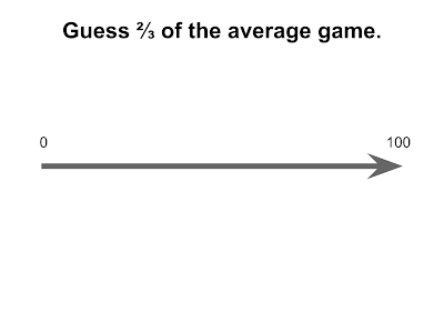
The two thirds of the average game is a great way of introducing game theory to students.
I've used this game on outreach events with +Paul Harper, at conferences with +Louise Orpin (when describing my outreach activities with other academics) and also in my classroom. I've blogged about the results before:
MSc students (Note that one point of this post is to show better graphs than the ones on those posts)
The definition of the game from the wiki page is given here:
"In game theory, Guess 2/3 of the average is a game where several people guess what 2/3 of the average of their guesses will be, and where the numbers are restricted to the real numbers between 0 and 100, inclusive. The winner is the one closest to the 2/3 average."
I run this game once without any instruction. I just explain the rules and let them fill in the form in front of them (contained in this repo).
I then bring up slides discussing how iterated elimination of weakly dominated strategies leaves the "rational" strategy to be that everyone guesses 0.
After this I invite the participants to have a second guess. In general the results are pretty cool as you see the initial shift towards equilibrium. The fact that the winning guess in the second play of the game is in fact not 0 gives an opportunity to discuss irrational behaviour and also what would happen if we played again (and again...).
I've run this game a couple of times now and here's the graph of the histogram showing the results for all guesses I've recorded.
You certainly see that the guesses move after rationalising the strategies. Funnily enough though no one has guessed 100 during the first guess but a couple of people have in the second guess. I assume this is either some students trying to tell me that I'm boring them, trying to help a colleague win or I'm perhaps not doing a great job of explaining things :)
Here's some graphs from the individual events that I've collected data for:
Academic at a talk on outreach at YOR18 (The OR society conference for early career academics):
Despite the low number of participants in some of the events they all show a a similar expected trend: the second guesses are lower. Surprisingly on one occasion the second winning guess was actually 1! This is a very quick move towards the theoretical equilibrium.
These experiments have been done on a much wider scale and in a much more rigorous way than my humble "bits of fun" for example the coursera game theory MOOC collect a bunch of data on this game and there's also a pretty big experiment mentioned in this talk:
Having said that I can't recall if other experiments look at successive guesses following an explanation of rational behaviour...
I've put all the code used to analyse a game on github. It's a simple python file that can be pointed at a directory or a file and will produce the graph (using matplotlib) as well as spit out some other information. The data set for all these events (the first graph on this post) is also on there and if anyone would like to add to it please let me know :)
(There's also the handout that I use to get the student answers in the repo)
(If you found your way here because of interests in game theory this previous post of mine listing free OSS software for game theory might be of interest)